


GUIDE TO PICKING THE PERFECT
Embroidery Thread Colors
A Branded Approach to Building Your Thread Palette
Think Like a Brand, Not Just an Embroiderer
I recently taught a two-day class at B Sew Inn in Oklahoma. We covered a lot of ground — tote bags, patches, charms — and everything coordinated beautifully. Then someone asked a question I wasn’t quite expecting: “How do you choose your thread colors so that everything works together?”
My answer surprised a few people: I approach my designs like a brand, not just as an embroiderer. As embroiderers, we tend to be collectors — hundreds of thread colors, metallics, specialty threads, fall sets, holiday sets. This is fine, but we often wind up spending more time picking colors than actually stitching. The result is inconsistency: designs that don’t coordinate, collections that feel scattered rather than curated.
“Once I started approaching my palette the way a brand does, everything changed. My collections finally looked like they belonged together.”
What the Best Brands Already Know
I spent time researching brands whose visual identities I admired — Ralph Lauren, Lilly Pulitzer, Louis Vuitton, Tula Pink, and others. Very different companies, but they all share one thing: they don’t use very many colors. More importantly, they stay ruthlessly consistent in the colors they do use. That consistency is what makes their work immediately recognizable and cohesive.
I applied that same philosophy to my own work. I stripped my everyday thread selection down to the bare essentials — enough variety to execute any design in my current catalog, but not so many that collections stop coordinating with each other. The result was four distinct palettes, each built around a specific aesthetic.
One important rule across all four palettes: I deliberately avoid jewel tones. Deep saturated purples, electric blues, vivid emeralds — beautiful in isolation, but they’re the colors most likely to throw off an otherwise cohesive palette. Treat them as specialty accents, not staples.
01 Modern Muse

The Foundation Palette — Contemporary & Versatile
Modern Muse is my base palette — the one I reach for first, for everything. These are the colors I use across the widest range of designs, and the collection I recommend to anyone building their first curated thread selection.
With 29 carefully selected colors including two metallics, this palette covers warm neutrals, earth tones, a full range of blues and greens, and enough reds and pinks to handle florals, Americana motifs, and fashion-forward details. The colors are bright but intentionally restrained — contemporary without being trendy. If you’re building from scratch, start here.

02 Western

Warm Neutrals & Classic Western Tones
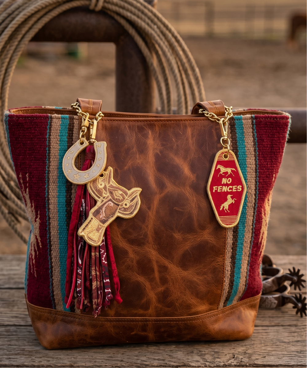
The Western palette is built on a foundation of rich neutrals — tans, khakis, warm browns, and saddle tones — with the classic accent colors that define western design: neutral reds, burnished golds, and deep navy blues.
This is the palette for anything with a southwest, ranch, or country feel: horseshoe charms, serape patches, boot motifs, and anything that wants to feel worn-in and authentic. Metallics here lean warm — antique brass and aged gold rather than bright chrome. The reds are dusty and muted, which keeps everything cohesive and avoids the over-saturated look that makes western designs feel costume-y rather than genuinely crafted.

03 Coastal

Modern Muse + Coastal Brights
The Coastal palette is essentially Modern Muse with the color temperature shifted toward the water. The foundation is the same — warm neutrals, metallics, classic earth tones — but it expands into brighter shades of aqua, sky blue, seafoam, sandy orange, and warm yellows.
Think of it as Modern Muse after a beach vacation. The personality is looser and sunnier, but it never breaks into jewel territory. The teals stay true, the blues stay sky-bright rather than electric, and the corals and ambers read as sun-baked rather than neon. With 28 colors, this is the palette for coastal collections, tropical motifs, and anything that evokes a warm-weather outdoor lifestyle.

04 Reverie

Soft, Muted & Vintage — Less Is More
Reverie is my smallest palette — 18 colors — and intentionally so. This is the vintage palette, built for florals, heirloom designs, cottage-core aesthetics, and anything that wants to feel soft, timeless, and romantic.
Every color here is muted. No bright pinks — only blush, rose quartz, and champagne. No vivid blues — only soft sky, baby blue, and a quiet denim. Even the metallics lean antique and soft rather than modern and bright. The Reverie palette proves that a smaller, more focused selection is often more powerful — when every color belongs to the same visual family, everything you make automatically coordinates.

Using This System
About the Thread Charts
All charts show Madeira threads. If you prefer a different brand — Robison-Anton, Isacord, Sulky, Floriani — use any of the free online thread conversion tools to find equivalent colors. The color names and visual swatches are your most important reference regardless of brand.
I Didn’t Throw Anything Away
This system is my default toolkit — not a restriction. I still use specialty colors, seasonal palettes, and individual favorites for specific projects. Think of it like a capsule wardrobe: the capsule is your cohesive daily foundation. That doesn’t mean you never reach outside it — it means you always have a reliable base that’s ready to go.
Starting Your Own Palette
◆ Choose one aesthetic for your primary collection and build that palette first.
◆ Start with neutrals and metallics — the connective tissue of any palette.
◆ Add your most-used accent colors, but keep the total under 30.
◆ Lay threads out together visually. Do they look like a family?
◆ Remove any color that fights the others. When in doubt, take it out.
◆ Stitch consistently within the palette for one full collection and see how your work changes.
“The goal isn’t fewer colors for its own sake. The goal is a palette where every color belongs — and where every design you make belongs to the same story.”
Wild Threads • Anita Goodesign • anitagoodesign.com


1 comment
Oh my Thank you, thank you, thank you… I can now move forward with confidence in my colors… I love the direction you are going. My best to you and yours. Love the new “E” Ticket ride!!!